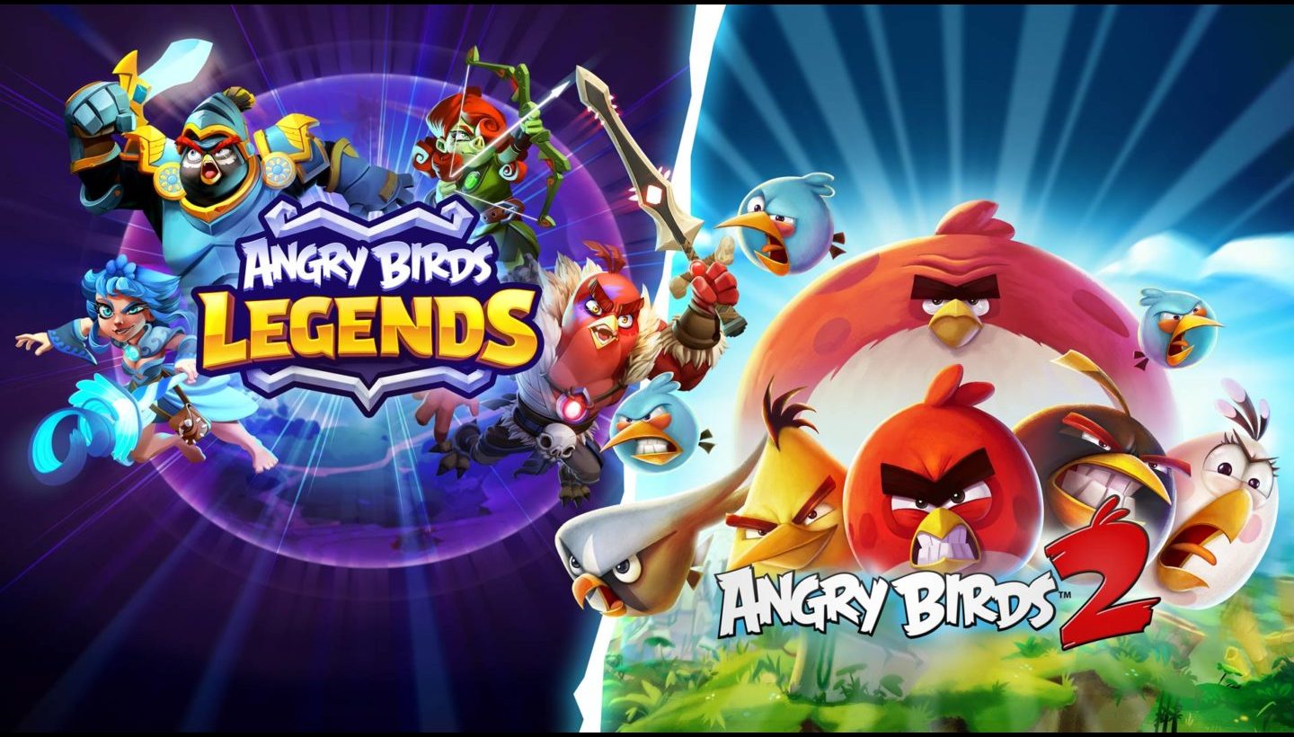
UI artists Eduardo Carril and Di Zhong share their experiences creating UI in two very different Rovio games, Angry Birds 2 and Angry Birds Legends.
Whether it is through on screen menus, buttons, or pop-ups, players navigate and make sense of a game through its UI. It’s down to the UI to take all of the most crucial information and resources for playing a game and put it right where players need it. Effective UI can contribute to longer play sessions and increased retention. Conversely, UI challenges can contribute to early player churn. After all, in a competitive space like mobile games, players are not likely to grapple with an unintuitive interface for long. The slightest sign of friction can send a player moving on to the next game. Therefore, crafting intuitive and effective UI is instrumental to creating games that are revisited by players again and again.

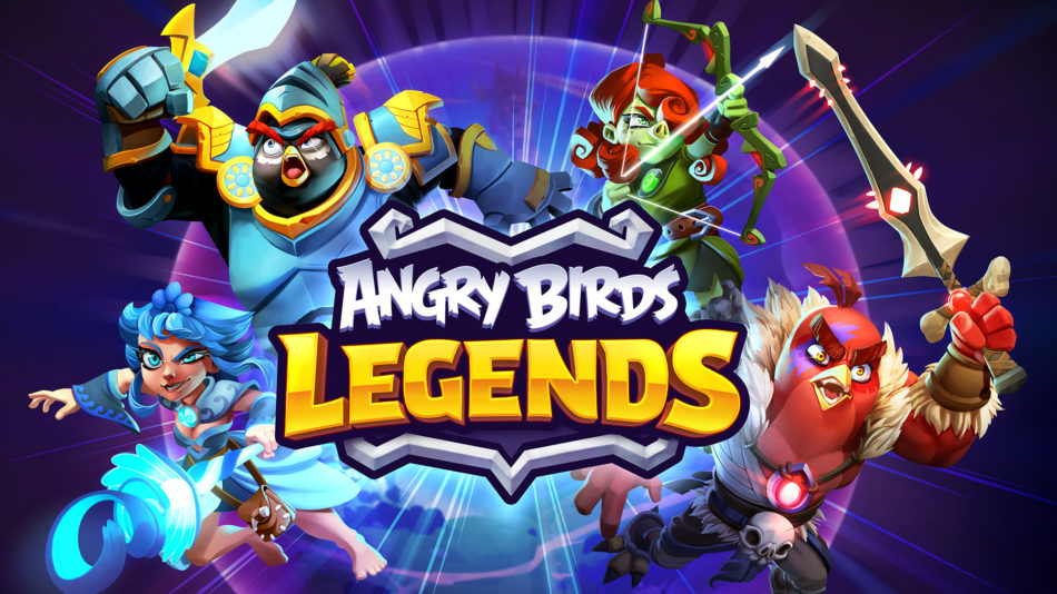
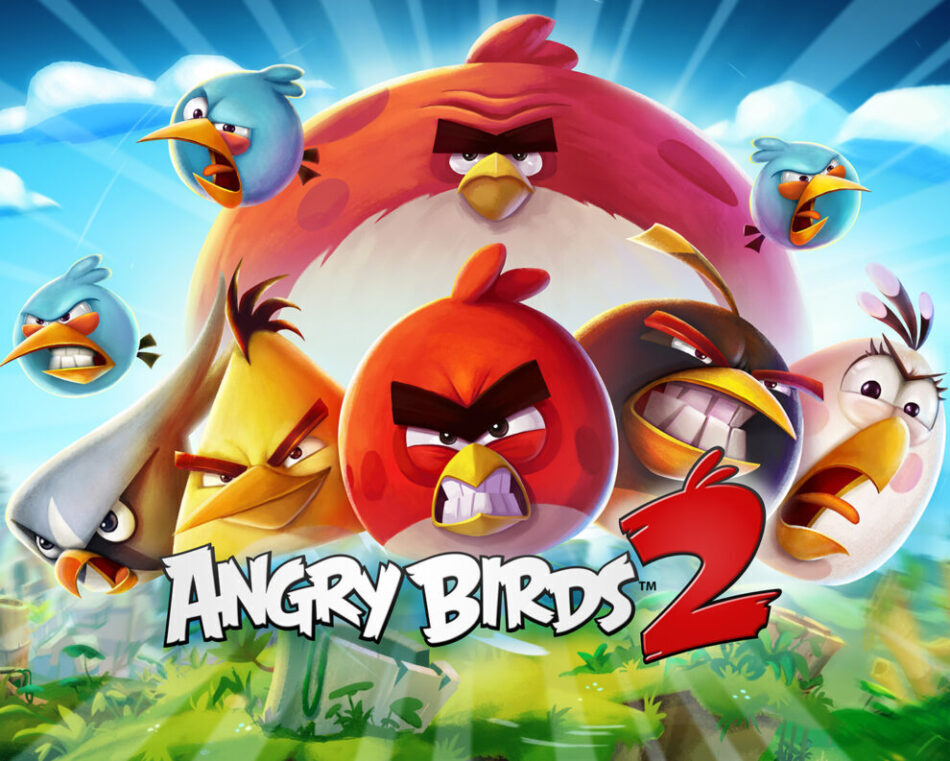
So how is effective UI created that allows players to get right to the fun and keeps them coming back? It turns out that the challenges facing new games and well established titles are quite different. Rovio UI artists, Di Zhong and Eduardo Carril compare these two unique scenarios with the currently soft launched RPG, Angry Birds Legends (currently available in Finland, Sweden, Poland, and the US), and long-standing fan favorite, Angry Birds 2.

Overall, the role of UI is the same in both old and new games, guiding players through the game and directing their attention to the most relevant information with on screen assets. In the words of Angry Birds Legends UI Artist, Di Zhong, “The game designers are involved in the inner workings of the game, things that might not necessarily be seen by the player. My job as a UI Artist is to take that and put it into a language that the player can understand. So the buttons, colors, things that respond to your actions. I’m shaping the things that are directly used by the players.”
Whether early or late in development, listening to those players is important every step of the way. Sometimes the feedback is direct, which was the case with a seemingly harmless layout change made by Senior UI Artist, Eduardo Carril, in Angry Birds 2, “a while ago I changed the position of some buttons inside the gameplay and it was uh, not very well received (laughs). There were two buttons hidden up by the pause button, and I made a kind of a by-the-book UI 101 decision to put them where they would be more easy to reach.” However, a lot of players already used that space to activate the abilities of the bird, tapping the screen while the bird is in flight, and they ended up tapping the buttons accidentally. “It was annoying for them to try to tap there and get this popup. We got a lot of feedback from players through player support, and we fixed it quickly.”

Other times, reacting to players’ wants and needs is more indirect. When creating a new game like Angry Birds Legends, the goal is to find what resonates with players through extensive testing. Di again, “with new game development, for example if you’re working on a prototype, we might not know which direction the game will go. There is a lot of room to experiment, and that involves a lot of testing to find the right style. In the beginning, we create a wide variety of UI styles and concepts, testing to see which ones our audience will react to. In that way, UI design plays a large role in deciding which direction the game will take overall. When we talk about game concepts, most people think of environments and characters, but that’s only the universe for the game, but in the end the UI is the skeleton that allows the game to stand up.”
For older games like Angry Birds 2, all of the decisions on the general style of the game have already been made. The focus then is on improving existing UI elements and creating UI for new game features within an established style. Here’s Eduardo Carril on creating UI for just such a game, “All older games have their challenges regarding how easy it is to propose new things, how easy it is to adapt new content to the already existing layouts. The UI in Angry Birds 2 in particular is very art-heavy. Everything is illustrated so sometimes it’s slower to work on for that reason. It’s challenging, but I like that! That’s what I came here for.”
the project I have had the most fun working on is Angry Birds 2. We have the flexibility to be creative and question everything – code, design, art.Eduardo Carril
That doesn’t mean that the team can’t shake things up. Eduardo again, “We always try to push the boundaries. I have worked in UI for eight years now in different companies, and so far the project I have had the most fun working on is Angry Birds 2. We have the flexibility to be creative and question everything – code, design, art. We have a rule that nothing is sacred, we can always question what is in the game. That doesn’t mean breaking everything down, but we shouldn’t just stick with old customs just because they’ve been there forever. I think that’s super healthy for any project.”
See Eduardo and Di’s work in action in Angry Birds 2 and Angry Birds Legends, available in the App Store and Google Play*. Interested in joining Rovio as a UI artist? Take a look at our open positions here.
*Angry Birds Legends is now available in Finland, Sweden, Poland, and the US.